Articles
How UX simplifies social planning in group apps
Discover how smart UX design in group apps eliminates planning chaos for young adults through integrated tools, glanceable interfaces, and low-pressure coordination features.
How UX simplifies social planning in group apps
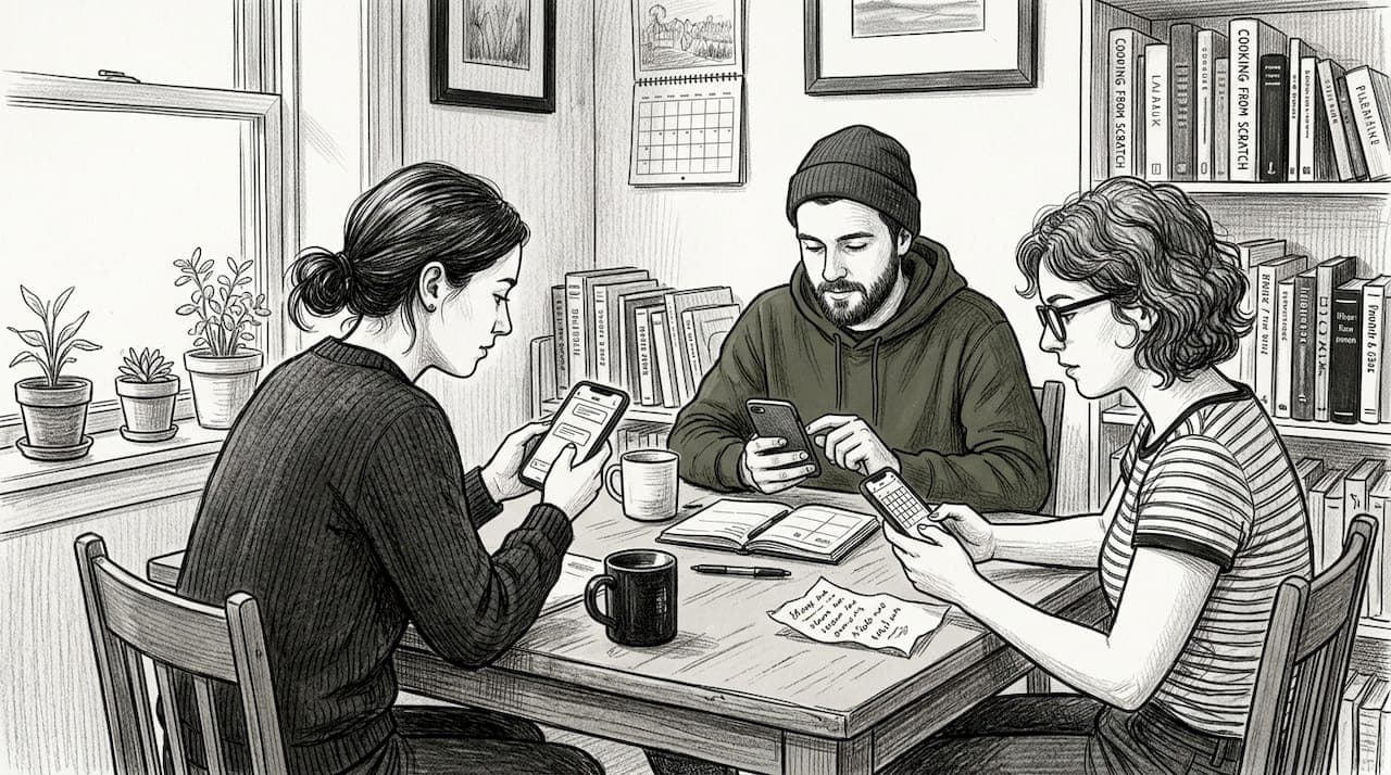
Planning a hangout with friends shouldn't feel like herding cats, yet it often does. Group chats explode with dozens of messages, scheduling conflicts pile up, and half the crew ghosts when it's time to commit. This chaos isn't your fault. Traditional planning methods weren't built for the way young adults coordinate today. The solution lies in smart UX design that transforms group apps from confusing message threads into streamlined coordination tools. When apps integrate the right features with thoughtful design, social planning becomes effortless, letting you focus on the fun instead of the logistics.
Table of Contents
- Key takeaways
- Understanding how UX reduces planning friction in group apps
- UX design methodologies powering effective group apps
- Navigating challenges: solving group planning edge cases with UX
- Balancing pragmatic and hedonic UX to enhance casual group engagement
- Discover efficient social planning with Groop Labs
- What is UX and why does it matter in group apps?
Key Takeaways
| Point | Details |
|---|---|
| Unified planning tools | UX integrates chat, calendars, and conflict resolution in one interface to reduce switching and planning friction. |
| Glanceable conflict cues | Visual indicators flag scheduling problems in real time so you avoid wasted conversations. |
| Reduced mental load | Summaries of plans with participant lists and statuses help you check progress without wading through long threads. |
| Simple yes no maybe | Clear yes no maybe responses streamline decisions without open ended questioning. |
Understanding how UX reduces planning friction in group apps
Good UX design doesn't just make apps prettier. It fundamentally changes how you coordinate with friends by integrating chat, calendars, and conflict resolution into interfaces you can scan in seconds. Instead of jumping between messaging apps, calendar apps, and poll tools, everything lives in one place. You see who's available, where conflicts exist, and what decisions need making without scrolling through 50 unread messages.
Glanceable interfaces use visual cues like conflict badges to flag scheduling problems immediately. When three people can't make Saturday but the chat keeps suggesting it anyway, a simple red indicator saves everyone from wasted discussion. This design approach respects your time and mental energy. You shouldn't need to decode lengthy threads to understand the plan status.
Reducing mental load is central to effective hassle-free group apps benefits. Apps summarize plans visually with clear participant lists, proposed times, and response statuses. Low-pressure interactions mean you can check in, vote on options, and move on without feeling obligated to engage in lengthy discussions. The interface does the heavy lifting so your brain doesn't have to.
Smart UX tactics transform coordination:
- Chat-first flows that feel natural for social conversation
- Flexible calendar views showing group availability at a glance
- Automatic conflict detection that surfaces issues before they escalate
- Simple yes/no/maybe responses instead of open-ended questions
- Visual progress indicators showing how close you are to finalizing plans
Pro Tip: Look for apps with glanceable conflict indicators that update in real time. Catching scheduling clashes early prevents the frustration of rebuilding plans from scratch when someone finally mentions they're unavailable.
UX design methodologies powering effective group apps
Behind every smooth app experience sits rigorous UX research and design work. Designers use user journey mapping, usability testing, and heuristic evaluation to understand exactly where friction occurs in group planning. They map every step from opening the app to finalizing a hangout, identifying pain points where users get confused or give up.
Iterative prototyping drives continuous improvement. Designers start with rough sketches testing basic concepts, then progress through increasingly detailed versions. Low-fidelity to high-fidelity prototyping with affinity mapping helps teams organize user feedback and prioritize which features matter most. Each round of testing reveals what works and what confuses people.
Safety and low-pressure interactions are non-negotiable for casual social apps. Young adults won't use tools that feel demanding or expose them to awkward social situations. UX research focuses on creating environments where declining an invitation feels comfortable and changing your mind doesn't create drama. The design must support the social dynamics of real friendships.
A typical UX design cycle for group event planning app tips follows these steps:
- Conduct user interviews to understand current planning frustrations and workflows
- Map user journeys identifying every touchpoint and potential friction moment
- Create low-fidelity wireframes testing core concepts with target users
- Run usability tests observing where participants struggle or hesitate
- Refine designs based on feedback and build higher-fidelity prototypes
- Perform heuristic evaluations checking against established UX principles
- Test again with real users in natural social contexts
- Launch with analytics tracking actual behavior patterns
- Iterate based on real-world usage data and continued user feedback
Pro Tip: The best apps test with actual friend groups, not individual users in isolation. Social dynamics change behavior dramatically, so usability testing must reflect real-world group contexts to catch issues that only emerge during actual coordination.
Navigating challenges: solving group planning edge cases with UX
Even great apps face predictable problems when groups try to coordinate. Choice overload in group chats leading to flaking, ghosting, scheduling conflicts, miscommunication in larger groups, no-shows, and safety concerns plague social planning. These edge cases aren't rare. They're the norm that UX design must address head-on.
Message overload kills momentum faster than anything else. When 30 messages arrive discussing possible dates, restaurants, and logistics, most people tune out. UX solutions focus on containment and clarity. Smart apps use:
- Minimal notifications that only alert for decisions requiring your input
- Summary views condensing discussions into actionable choices
- Threaded conversations separating logistics from social chat
- Deadline reminders that create gentle urgency without pressure
- Clear cancellation flows that notify everyone instantly
Attendance minimums combat flaking by setting expectations upfront. If a plan needs at least five people to work, the app makes that visible and won't finalize until enough people commit. This transparency prevents the disappointment of plans falling apart at the last minute.
| Common problem | UX solution | Outcome |
|---|---|---|
| Message overload | Glanceable summaries and threaded conversations | Users stay informed without reading everything |
| Scheduling conflicts | Visual calendar overlays with conflict badges | Groups spot issues immediately and adjust |
| Flaking and ghosting | Attendance minimums and commitment tracking | Plans only finalize with sufficient participation |
| Miscommunication | Clear decision points and status indicators | Everyone knows what's decided and what's pending |
| Safety concerns | Verified user profiles and group controls | Trust increases, participation rises |
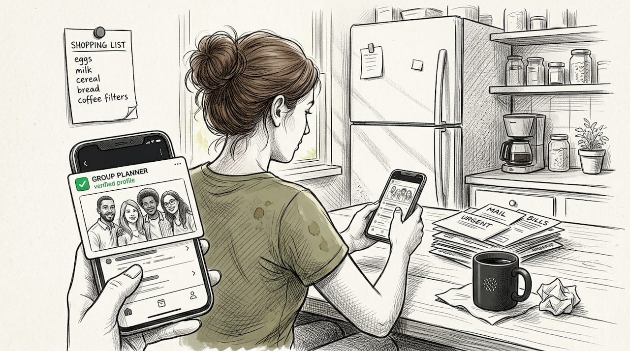
Safety cues matter enormously for young adults planning activities with people they might not know well. Verified profiles, mutual friend indicators, and group admin controls create psychological safety. When users feel secure, they're more likely to commit to plans and actually show up. The UX must signal trustworthiness through every design choice.
Pro Tip: Set attendance minimums for any activity that requires a critical mass. This simple group chat etiquette tips practice reduces flaking by making expectations clear and preventing plans from limping forward with insufficient participation.
Balancing pragmatic and hedonic UX to enhance casual group engagement
UX design operates on two dimensions that serve different user needs. Pragmatic UX focuses on utility, making tasks efficient and straightforward. Hedonic UX emphasizes enjoyment, creating experiences that feel fun and emotionally satisfying. Group chats weren't built for decisions, and leisure apps must blend both approaches to keep young adults engaged.
Pragmatic features get the job done. Calendar integration, conflict detection, and decision tracking provide the functional backbone that makes coordination possible. These elements answer the question: can this app actually help me plan efficiently? Without solid pragmatic UX, users abandon the tool regardless of how fun it feels.
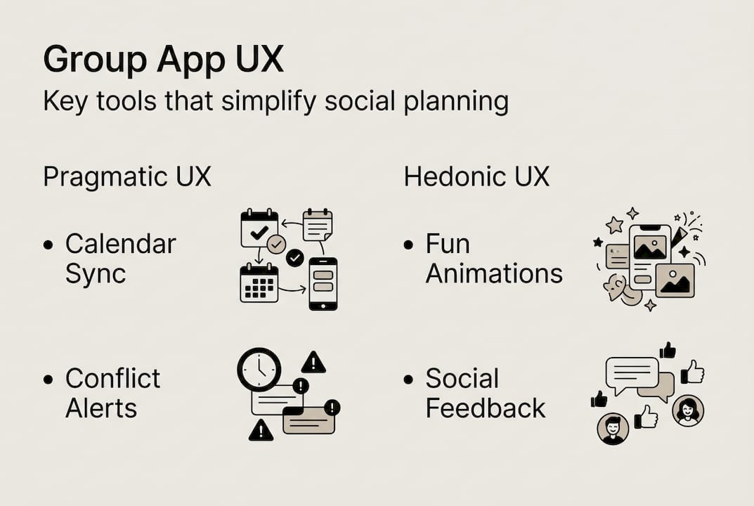
Hedonic features make the experience enjoyable. Friendly visual design, playful animations, and social feedback loops create positive emotional associations. Young adults choose apps that feel good to use, not just functional. The interface should reflect the casual, fun nature of hanging out with friends rather than feeling like project management software.
| UX dimension | Key features | Impact on behavior |
|---|---|---|
| Pragmatic | Calendar sync, conflict alerts, decision tracking | Increases efficiency and reduces coordination time |
| Pragmatic | Clear status indicators, simple yes/no responses | Minimizes confusion and decision fatigue |
| Hedonic | Friendly visual design, playful micro-interactions | Creates positive emotional associations with planning |
| Hedonic | Social feedback, celebration moments | Increases engagement and makes coordination feel fun |
| Balanced | Low-pressure participation with clear outcomes | Maintains group momentum without feeling demanding |
Young adults prefer apps that respect their time while matching their social energy. A group planning app that feels like a chore won't get used, no matter how efficient. Conversely, an app that's all style with no substance frustrates users who need actual coordination help.
Practical ways to balance both UX dimensions:
- Use intuitive icons and navigation that require zero learning curve (pragmatic)
- Add celebratory animations when plans finalize successfully (hedonic)
- Provide quick-reply options that minimize typing (pragmatic)
- Include friendly copy that sounds like how friends actually talk (hedonic)
- Show clear progress indicators so users know where things stand (pragmatic)
- Design with colors and typography that feel energetic and social (hedonic)
The context matters enormously. Planning a casual hangout requires different UX than coordinating a work project. Leisure apps should lean slightly toward hedonic design while maintaining pragmatic efficiency. The goal is making coordination feel like part of the fun, not a separate task you must complete before the fun begins.
Discover efficient social planning with Groop Labs
If you're tired of endless group chat chaos and want coordination that actually works, Groop Labs delivers exactly what young adults need. The platform combines smart scheduling tools with the casual vibe of chatting with friends, eliminating the friction that typically kills plans before they start.
Groop Labs surfaces conflicts automatically, shows availability at a glance, and keeps decision-making pressure-free. You can start a plan, see who's available, and finalize details without drowning in messages or polls. The interface focuses on getting you from idea to confirmed hangout as smoothly as possible.
Explore practical strategies for group scheduling social plans that reduce coordination time dramatically. Learn how to plan group hangouts easily with friends using tools designed specifically for casual social coordination. The platform handles logistics so you can focus on enjoying time together.
What is UX and why does it matter in group apps?
UX means user experience, encompassing how easy and enjoyable an app feels when you use it. Every interaction, from opening the app to completing a task, contributes to your overall experience. Good UX feels invisible because everything works intuitively without requiring thought or effort.
In group apps, strong UX reduces confusion and makes coordinating with friends genuinely simpler. You shouldn't need a tutorial to understand how to propose a hangout time or see who's available. The interface should guide you naturally through each step.
UX matters because it prevents frustration and saves time when planning social activities. Poor UX turns what should be fun into work, causing people to avoid using the app entirely. When coordination feels effortless, groups plan more activities and actually follow through instead of letting ideas die in chat threads.
How do group apps handle scheduling conflicts with UX?
Smart apps use conflict badges and glanceable calendars to highlight scheduling issues the moment they appear. Visual indicators show exactly which proposed times won't work for specific people, eliminating the need to read through messages asking about availability.
This clarity helps groups quickly adjust plans without lengthy chat threads. You see the problem, propose alternative times that work better, and move forward. The group scheduling social plans process becomes a quick decision rather than an extended negotiation.
What are the main challenges users face in group planning apps?
Common issues include choice overload when too many options paralyze decision-making, miscommunication about details like time or location, and flaking when people commit but don't show up. These problems compound in larger groups where coordinating becomes exponentially harder.
UX solutions involve simplification through limited choices, safety cues like verified profiles, and minimum attendance policies that prevent plans from proceeding without sufficient commitment. Following solid group chat etiquette tips also helps maintain group momentum and reduce friction.
How can I make my group's planning easier with UX principles?
Choose apps with clear summaries that condense discussions into actionable decisions and low-pressure interactions that don't demand constant engagement. Look for tools that respect your time by only notifying you when your input is actually needed.
Use features like glanceable calendars and conflict alerts to avoid confusion before it starts. These tools surface problems early when they're easy to fix rather than letting issues hide until plans fall apart. Encourage your group to set attendance minimums for activities that need a critical mass, reducing the likelihood of disappointing last-minute dropouts.
Apply these strategies when you plan group hangouts easily with friends and watch coordination stress disappear. The right tools combined with smart practices transform planning from a chore into a quick, painless step toward having fun together.